Creating effective classroom resources is essential for teachers in early learning. In this article, we will delve into the topic of designing classroom resources that cater to the needs of young students.
Originally titled by Chris Hough, Sprig’s remarkable graphic designer and former primary teacher, we are revisiting this topic to provide updated information and insights.
The aim is to assist teachers in crafting the best resources for their students in early childhood education.
These tips and tricks will equip you with the knowledge and skills you need to craft your own teaching tools and classroom resources.
Fonts Design Tips & Tricks for Teachers in Early Childhood Education
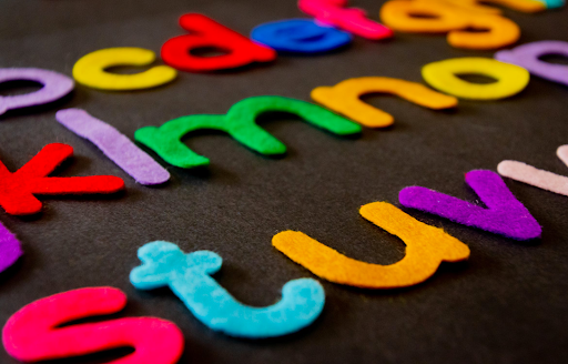
Fonts are one of the most important elements to consider when designing resources for the classroom.
Why Is It So Important to Choose the Right Font?
Choosing the right font is absolutely essential when creating classroom tools and resources. The wrong font can result in children misunderstanding content, or in some cases, being unable to fully process or understand the information being presented to them.
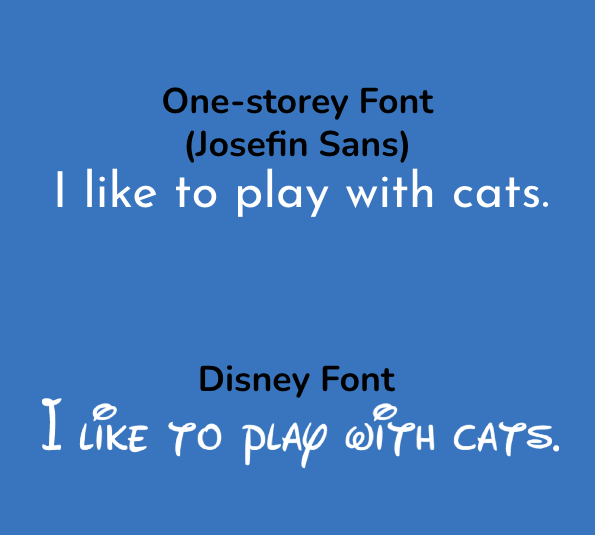
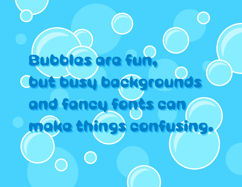
Our first piece of advice is to resist the urge to choose cute, playful fonts. These fonts are most likely to confuse and trip up young learners. The ‘Disney’ font, for example, is adorable in appearance but would be terribly difficult for children at this age who are learning to both read and write.
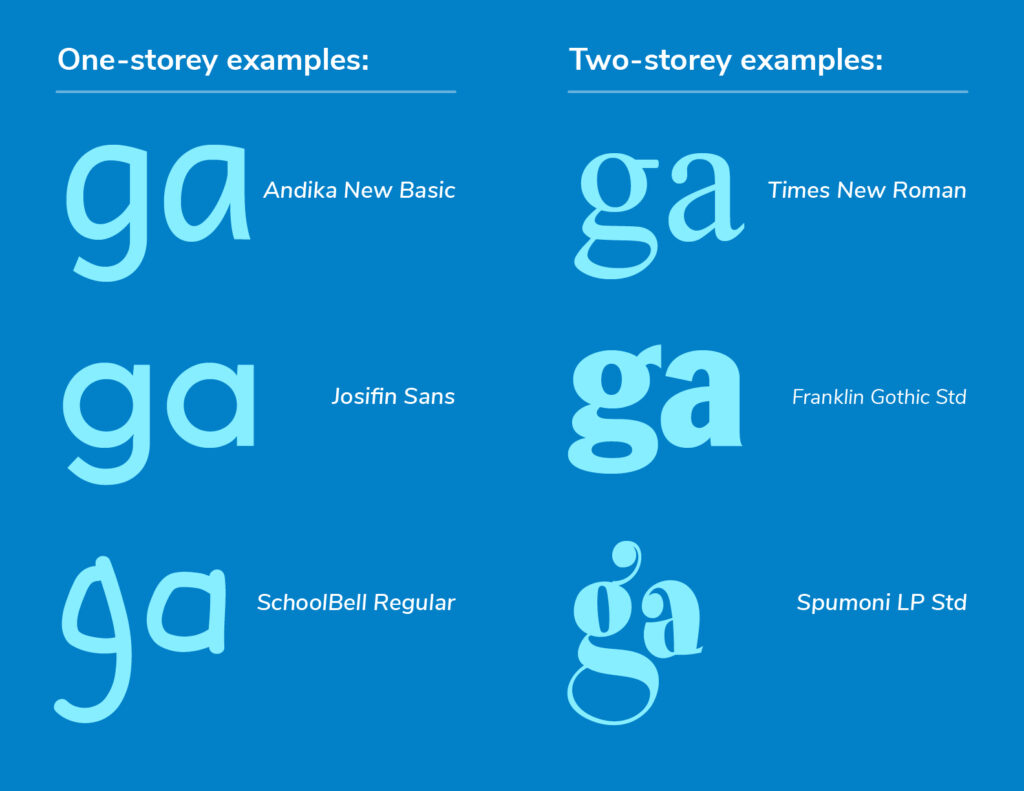
One-Storey vs. Two-Storey Letters – What’s the Difference?
One-storey (or single-storey) letters are the ones we first learn to write as young children; they are most commonly used in handwriting, traditional calligraphy, and even in many italics.
On the other hand, some letters have two-storey (double-storey,) versions used by almost all serif fonts (like Times New Roman), and many sans serif ones, too (like the one this blog is written in).
The best example to illustrate this is to look at the letter ‘g’. The letter ‘g’ comes in both single- and double-story variants, either coming with a loop, or tail. We are taught to write single-storey g’s as children because it’s most common in handwriting and is the easiest to replicate for early learners. The letter ‘a’ also looks significantly different when you compare the one-storey and two-storey versions.
Take a look at the visual below. Keep in mind that two-storey a’s are far more common than two-storey g’s. Keep an eye out for the tail on the letter ‘t’ as well – it could also be an issue depending on the font you choose.
How Will I Know if a Font Is Going to Be Right for My Students?
It is recommended you start by typing out every letter of the alphabet, all of the numbers and all commonly used punctuation, using both uppercase and lowercase characters. Take a look at each character carefully and ask yourself if they could be difficult for a young child or someone with impaired vision to read.
Tip: Create and save a text document on your computer that includes the full alphabet (upper and lower case), punctuation marks, numbers, and a few example sentences.
From there, copy those and set them into a few different sizes and styles (italic, bold). You can also include a white version of the characters on a dark background to see how it looks reversed.
Here’s a comparison of two different fonts, one that is much easier to read than the other:
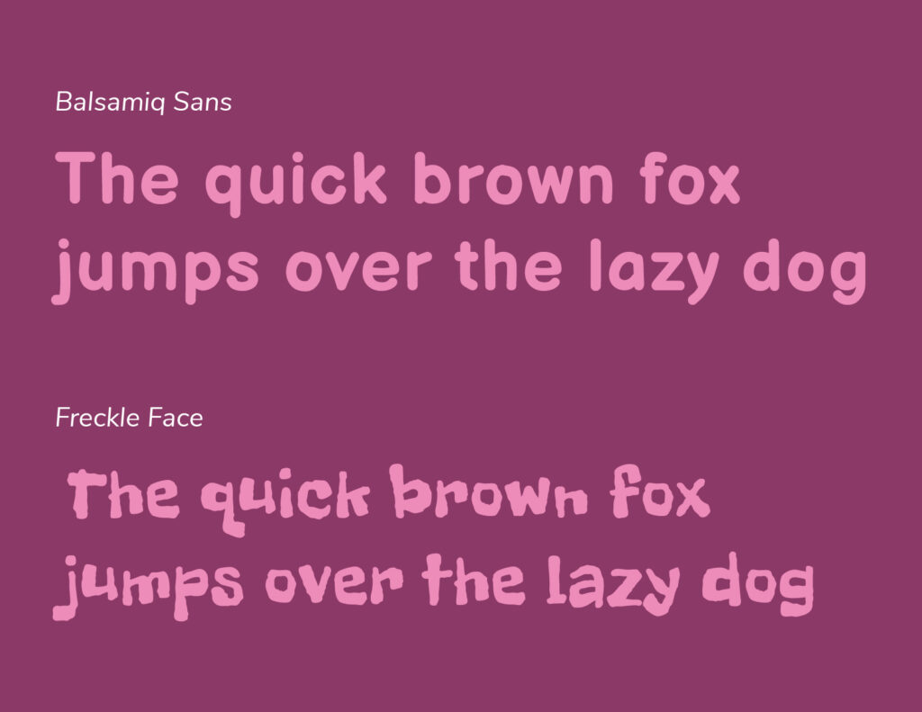
The second font in this example (Freckle Face) is fun from a design standpoint, for sure – but it’s more likely to cause confusion with your students.
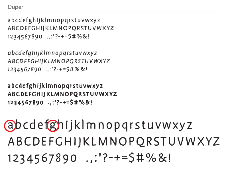
To further illustrate this point, we tested out the font ‘Duper’ that we really liked here at Sprig, but ran into problems with the letters ‘a’ and ‘g’ presenting as two-storey (circled in red below).
Once You’ve Settled on a Font That You’re Happy With, Ask Yourself These Questions Before Finalizing and Printing Out Your Classroom Resources:
- Are all the characters easy to recognize?
- Does this font include all of the characters that you need?
- How legible is it, especially at smaller sizes?
- Does it have a variety of styles?
Design Software Can Be Very Expensive – Do You Have Any Free Resources to Recommend?
There are a ton of free resources out there, and we’ve put together a quick list of our favourites that are easy to use with little to no experience required:
- Google Fonts: A huge catalogue of free fonts you can download
- Canva: Design tools and templates for creating resources, or for organizing the classroom (Canva Pro gives you access to more stock images and photography, as well as useful design tools – although it comes at a monthly cost);
- Unsplash, Rawpixel, Pixabay: Free stock photography sites that also have a good selection of illustrations (more on copyright, fair use/fair dealing, and creative commons/attribution to come in a future post – stay tuned!)
Process & Execution Design Tips & Tricks for Teachers in Early Childhood Education
While in the previous section, the focus was on fonts, Sprig will now shift the spotlight to the design process and execution.
To design effective classroom resources for early learning, it’s important to have a well-planned design process from start to finish. Chris will now cover the necessary steps to ensure your classroom resources are accessible, visually appealing, versatile, and functional.
Chris will provide insights on how to create engaging resources, drawing inspiration from your own ideas or borrowing from online activities and adding your own personal touch.
Step 1 – Brainstorm Answers on Designing Classroom Resources
Start by asking yourself the following questions:
- Have I come across any interesting ideas online recently that I’d like to put my own unique twist on?
- Have I come up with any concepts or ideas that I may not have previously followed through on?
- Is there something that myself, my students and/or other teachers could really benefit from having access to in the classroom?
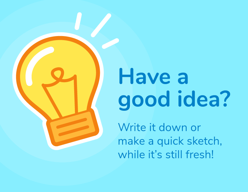
I usually start the creative process by grabbing screenshots of any ideas/inspiration I stumble upon while doing research online. I will either jot down ideas in a notebook or on my phone and use a Google Drive folder to save screenshots of ideas I come across.
Tip: It is recommended to look into note-taking tools such as Notability or Evernote; they have been built with the purpose of helping you to organize notes and important information – making them easier to locate when you need to refer back to them.
Step 2 – Clarify your Design Purpose and Goals
Now, ask yourself a few questions that will help you to better understand your specific reasoning for deciding to create these resources in the first place:
- What is the purpose of this resource? Why am I creating it?
- Does something similar already exist, or will this fill the need for a resource that I’ve been looking for but haven’t been able to find?
- What are the learning objectives associated with this resource/activity?
Once you’ve answered those questions, it is recommended that you do a bit of research into other teachers’ lessons and resources online to see what has successfully worked in other classrooms. It is one example of collaborative planning, which is a mark of differentiated instruction that fuels successful student outcomes.
You may also stumble upon insight or feedback about a specific activity/resource that will help you to extend or improve upon an idea that may have previously had issues/shortcomings.
Step 3 – Sketch It Out
It sounds obvious, but I always recommend starting designs/new ideas by sketching them out on paper. That way, I can quickly work out the basics of the resource, and any possible variations I might want to create.
It gives you a chance to figure out what goes where, and how much space it might take up in the final design. You don’t need to be a master illustrator to sketch out these concepts; just lay it out visually in whichever way feels right to you.
Keep your sketches and ideas together in a sketchbook/folder, that way they’ll be handy when it comes time to review the process in planning to create the final product.
Tip: keeping records of your thought process will really help to improve the quality of your future work/designs.
Step 4 – Time to Create
Once I’ve done enough research and have sketched out a rough concept, I start building the resource in my design program of choice. Depending on your comfort level, you can use free software like Canva or something more advanced like Adobe Suite/Creative Cloud.
Always keep an eye out for new software or updates that expand the limits of what you can do, and how efficiently you can do it. For example, Pages has added features that let you create interactive books. The resources section in the Sprig Learning educator portal has a variety of image assets you can use for building digital or printable assets.
Step 5 – Review and Finalize
Revisit the goals you set in the beginning and make sure they have been met with your final design.
Before you save and export your completed resources, it is recommended to walk through the following criteria (these are important points that I try to cover with each and every design I create):
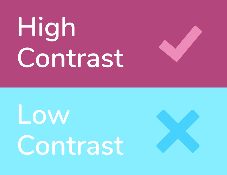
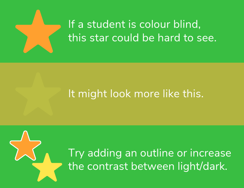
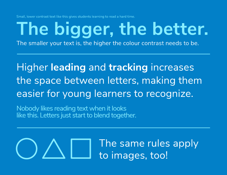
Is it Accessible?
This is especially important for resources that are in full colour. Your text shouldn’t be too small, contrast should be high, text should be easy to read and photos should pop on top of coloured backgrounds, and colours should be always used in a thoughtful, meaningful way. It’s also very important to keep those who are colourblind in mind (potential or formally diagnosed).
Students have different learning styles, such as visual, auditory, and kinesthetic. Designing resources that are accessible and cater to different learning styles can help to engage and accommodate a wider range of students.
In fact, holistic learning is one of Sprig’s core tenets, and by capturing input from every student, the right classroom resources can be created and used to best serve the student.
Here are a few examples to illustrate what accessible vs. inaccessible design looks like:
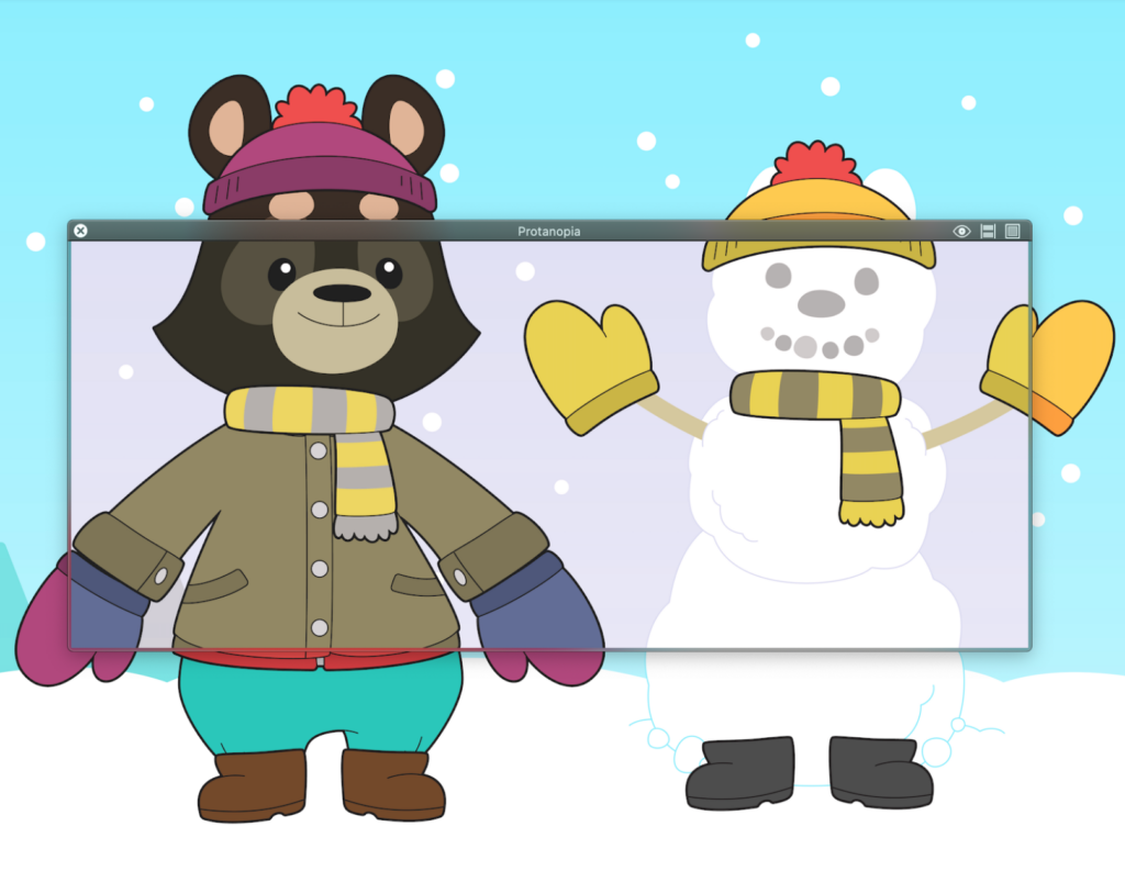
Sim Daltonism (for Mac) is a free tool that lets you test whatever is visible on your screen using filters that simulate different types of colour blindness. Get it here: https://michelf.ca/projects/mac/sim-daltonism/
Here’s a look at Sim Daltonism in action:
Is it Visual?
If it isn’t specifically a reading/writing activity, keep instructions visual, or use simple, familiar language. Consistency helps a lot, both in terms of vocabulary and imagery.
Is it Versatile?
My aim is always to give teachers room to use the resources I create in a way that suits their goals and the individual goals of their students. It’s even better if a resource can be used repeatedly in a multitude of different ways.
Unlike something found on Pinterest, resources that you’ve created yourself can be easily altered or adjusted to aid students who may require special accommodations, such as increased font size or an adjustment to the difficulty level.
Is it Simple?
Some free resources online clutter their designs with decorative elements or fancy fonts that aren’t especially legible. Fonts were covered in the last section.
A little goes a long way as they say; too much and you risk creating confusion that can interfere with the purpose of the resource and success rate of the activity itself.
Sample Resources
All About Me Sheet (Free to Download)
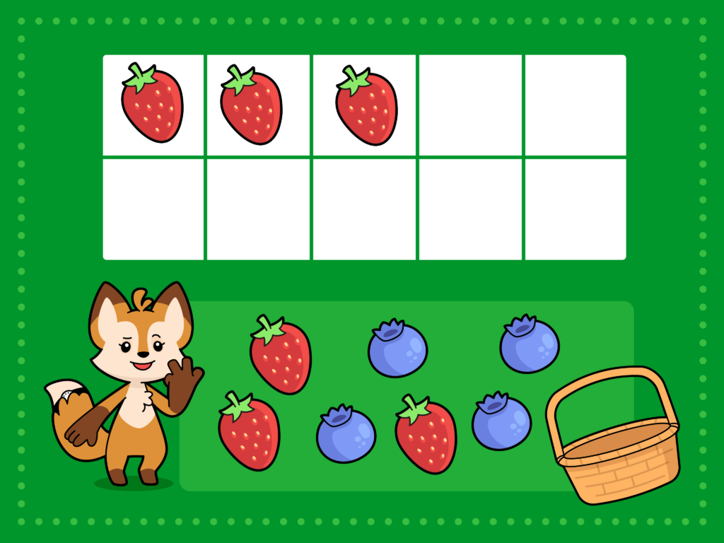
Berry Sorter
Is it Effective?
Lastly, one of the final questions I ask myself before exporting my work – is the resource I’ve created effective?
Does it cater to the goals/purpose I set at the beginning of the creation process? The answer to this may remain somewhat unclear until you’ve had a chance to test it out in a classroom setting.
By creating your own resources this way, making edits or quick changes to an activity that you’ve created is easy.
Content Design Considerations for Teachers in Early Childhood Education

As an early childhood education teacher, you now have a better understanding of which fonts to use and the design process required to create classroom resources that are both enjoyable and engaging for students.
There is one last remaining piece left in knowing how to best design classroom resources for teachers in early learning. Which is, what content should be designed?
Before embarking on the design process, it’s best to know 1) how the content aligns to the curriculum, and 2) who the content is for.
1: How the Content Aligns to the Curriculum
The content of the resources should align with the learning objectives and goals of the course or lesson. The learning objectives and goals should be outlined in the curriculum that is followed by the school. The resources should also cater to the developmental level and abilities of the students.
2: Who the Content Is For
The font, process and content designs in the article thus far have been geared towards the early learners. It is the students who will interact with these classroom resources. But there is a whole category of classroom resources that are meant for use by the teacher.
It can include feedback and assessment resources. Such resources should include ways for teachers to assess student progress and provide feedback. This can include quizzes, tests, or other assessments that help teachers gauge student understanding and adjust their teaching accordingly.
Another type of resource for teachers could be planning and organizational tools, such as lesson plans and schedules. These resources can help teachers stay on track and ensure that they cover all the necessary material within the given timeframe.
Sprig Learning has solutions which digitize such resources so teachers are more efficient in teaching their classrooms in line with evidence-based practices.
These solutions also contain actual classroom resources that can be printed and used to teach various essential early learning concepts.
This article however, covers the designing of content that is meant for students. It describes how to best design classroom resources for teachers to engage and teach their students.
Right Font, Right Process, Right Content
In conclusion, designing effective classroom resources for early learning is an essential task for teachers. Choosing the right font is a crucial factor in creating such resources.
Additionally, having a well-planned design process is critical in ensuring that the resources are accessible, visually appealing, versatile, and functional.
Finally, it is crucial to ensure that the content of the classroom resources aligns with the curriculum to maximize student outcomes; otherwise, all the effort put into the content design process would be in vain.
We hope this article helps to make the classroom resources design process more approachable and understandable. Stay tuned to the Sprig Blog for more classroom resources focused content in the future!
—
Note: Sprig does not endorse nor receive any monetary rewards for including links to software, programs, and/or tools recommended within this blog post.